Voices & Visions
As phase one in a semester long project, I conceptualized a social justice magazine, conducted reseach on consumer personifications, and created a typographic logo.
Magazine Objective and Title
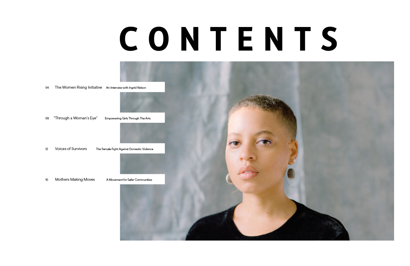
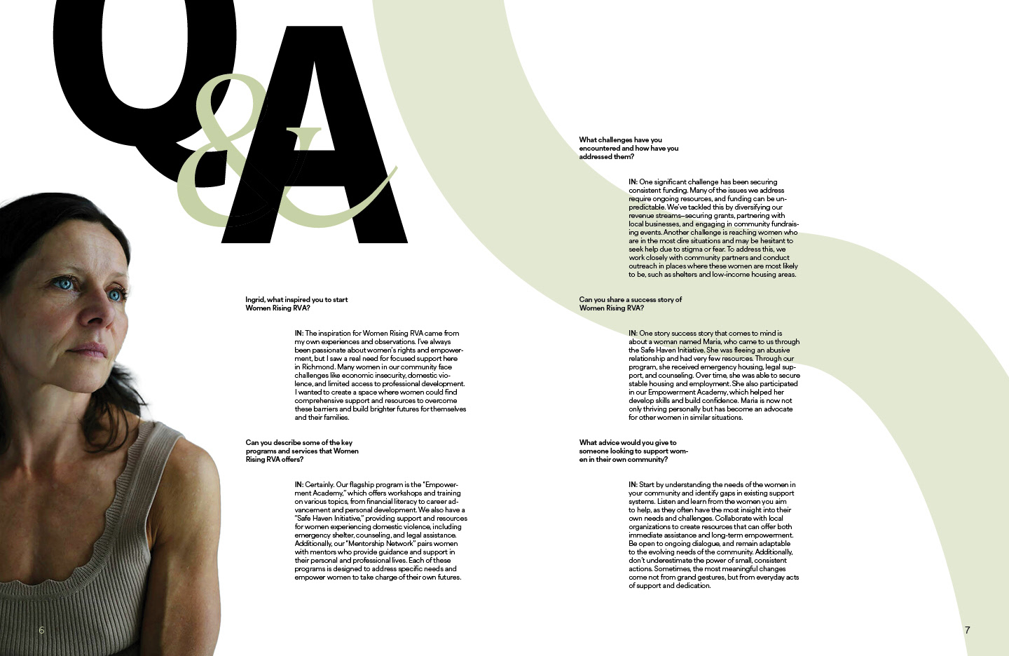
"Voices & Visions" - a refreshingly positive social justice magazine that highlights change makers, leaders, and activists making a difference in thier communities. This specific issue will focus on women.
Visual Research
Consumer Personifications
Maya
Maya is a 28 year old black women who works as a social media manager for a nonprofit. She is passionate about social justice, women's rights, and environmental sustainability. Maya is interested in 'Voices & Visions,' because she wants to connect with other women who are making a difference and learn about innovative solutions to societal issues.
Carla
Carla is a 45 year old Latina women and a director of a local arts organization. She enjoys attending art exhibitions, hosting book clubs, and participating in local government meetings to advocate for the arts. She is excited to read 'Voices & Visions,' as she is looking for inspiration and stories that showcase how women are leading the charge in their communities. She also apreciates content that explores the intersection of art and activism.
Laura
Laura is a 63 year old white woman and retired English teacher. She enjoys gardening, reading historical fiction, and leading workshops for younger women on leadership and advocacy. She subscribes to 'Voices & Visions,' to learn how younger generations are continuing the fight for equality and justice. She hopes to find stories that bridge the gap between ages and inspire collective action, as well as opportunities to support and mentor young activists.
Typography Sketches
In my initial sketches, I experimented with the letter "O" to represent a mouth and an eye. The first sketch was very literal, but my process led me to a more implied representation.
Digital Iterations
For the main type face of my typographic logo, I chose a clean san serif, Alber New. I experimented with a number of different typefaces for the "O" but finally landed on Condor Extended. It has the perfect amount of contrast where it stands out from the other letters while still being cohesive.
Final Typographic Logo
Color Application
The color pallete for 'Voices & Visions' represents the peaceful and postive tone of the magazine. The muted tones feel calm and clean; it is attractive without being flashy.